
What Scandinavian Design Principles Can Teach Us About Prose
I grew up in a house where every object had to earn its place. My grandmother would eye a new vase with the suspicion most people reserve for an uninvited guest. “Vad gör den här?” she’d ask. “What does this one do?” If the answer was merely decorative, it rarely stayed. This wasn’t frugality. It was a philosophy—a quiet certainty that beauty and function weren’t separate pursuits. Decades later, hunched over a manuscript at my desk, I still catch myself asking the same question of every sentence.
Scandinavian design gets reduced to pale wood and clean lines in magazine spreads, but it carries a deeper set of principles that govern more than interiors. Restraint, honesty of materials, clarity of purpose, a deep respect for negative space—these offer a surprisingly precise lens for examining prose. I spend my days reading and writing, and I’ve come to see these parallels not as metaphor but as method. The chair stripped of ornament and the paragraph stripped of excess share a common ancestry.
The Principle of Lagom: Just Enough
Swedish has a word that resists direct translation. Lagom hovers somewhere between “moderate” and “sufficient,” but its cultural weight is heavier than either. It suggests a state of balance—not too much, not too little, exactly right for the need at hand. In design, lagom shows up as a table that’s neither too large for the room nor too small for the family gathering around it. It’s the sweater knit from wool thick enough for winter but light enough for autumn.
In prose, lagom is the enemy of both bloat and starvation. Take the writer who, fearing obscurity, loads every sentence with qualifiers and subordinate clauses until the original thought buckles. Then take the writer who, fearing sentiment, pares away so much the text turns skeletal, bloodless. Lagom asks us to find the precise quantity of language that serves the idea—no adjective orphaned, no verb abandoned, but nothing extraneous padding the space between thoughts.
I once spent an afternoon removing the word “very” from a twenty-page essay. I didn’t do it out of pedantry. I was curious. The word appeared forty-three times. When I finished, I hadn’t just shortened the piece; in many places, I’d clarified what I actually meant. “Very tired” became “exhausted.” “Very old” became “ancient.” The prose didn’t shrink—it sharpened. That’s lagom in practice: not reduction for its own sake, but a calibration toward accuracy.

Honesty of Materials: Letting Words Be What They Are
Walk into a room designed by Hans J. Wegner or Alvar Aalto, and you’ll notice something peculiar: the materials don’t pretend. Wood is visibly wood, grain and knots intact. Steel remains steel, uncoated, unashamed of its industrial origins. Leather ages and darkens and cracks, and this is considered not a flaw but a record of use. The philosophy is simple: a thing shouldn’t disguise its nature, because truthfulness is itself a form of beauty.
Prose has its own materials—words, syntax, rhythm—and these, too, can be honest or deceptive. Dishonest prose often wears borrowed clothes. It reaches for the Latinate word where the Anglo-Saxon would do, not because it’s more precise but because it seems more impressive. It constructs sentences in the passive voice to avoid naming the actor, a grammatical evasion that erodes trust. It deploys jargon as a shield, signaling insider status while obscuring meaning.
I’m not arguing against complexity. Some ideas demand complex language, just as some chairs demand complex joinery. The question is whether the complexity rises from the demands of the material or from the writer’s vanity. When I read a sentence that strains for effect—a metaphor that calls attention to itself, a vocabulary choice that smells of the thesaurus—I feel the same unease I feel in a room full of fake wood veneer. Something essential has been covered up.
The writer who works with honest materials trusts that clarity carries its own weight. She uses “use” instead of “utilize” not because the latter is wrong, but because the former does the job without ceremony. She allows a short sentence to stand alone, knowing brevity can ring louder than amplification. She treats language as a craftsman treats oak: with respect for its inherent qualities, not a desire to make it something it isn’t.
Negative Space and the Pause Between Paragraphs
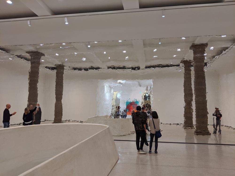
In Scandinavian interiors, emptiness is never accidental. The space between a sofa and a window, the bare wall above a sideboard, the uncluttered floor beneath a dining table—these aren’t oversights. They’re deliberate choices. Designers talk about “breathing room,” the visual silence that lets the eye rest and the mind register what’s present. Without negative space, even the most beautiful objects become noise.
Prose breathes in its own way. Paragraph breaks create pauses. Short sentences, dropped into a sequence of longer ones, create rhythmic variation. White space on a page isn’t wasted paper; it’s an invitation to reflect. A writer who ignores this principle fills every available inch with text, leaving the reader gasping for air. The result is exhausting—a dense thicket from which no single thought can emerge clearly.
I learned this lesson from a novelist I admire, who often ends chapters mid-scene, leaving a gap the next chapter doesn’t immediately fill. The first time I encountered it, I felt disoriented. Then I realized the gap was doing something: it let me inhabit the moment, to feel its unresolved tension without the author rushing to resolve it. In nonfiction, you can get the same effect with section breaks, with questions left hanging, with a paragraph that doesn’t overexplain its conclusion.
Consider the common advice to “kill your darlings.” That’s usually taken as removing beloved but unnecessary phrases. I think of it differently: I’m not killing anything. I’m creating space around what remains. A sentence can only be appreciated when it has room to stand. When I edit, I look for the moments where I’ve crowded my own ideas—where three good sentences are competing for the attention one would command if given air.
Form Follows Function: The Architecture of the Sentence
The phrase “form follows function” was coined by American architect Louis Sullivan, but it finds deep resonance in Nordic design traditions. A chair designed for dining has a straight back; a chair designed for lounging reclines. The object’s shape arises from its intended use, and any deviation from that purpose is seen as a design failure. This isn’t a limitation. It’s a liberation: when you know what something must do, you know what shape it must take.
In prose, a sentence’s function determines its architecture. A sentence aiming to build suspense will stretch itself long, delaying the verb until the final clause. A sentence aiming to deliver a fact will be direct—subject, verb, object, no detours. A sentence aiming to evoke a mood will lean on rhythm and sound, perhaps sacrificing strict grammatical economy for a cadence that lingers. The problem comes when a writer applies the same sentence shape to every task, as if all rooms required the same chair.
I keep a notebook where I copy sentences from writers whose architecture I admire. There’s a sentence from Virginia Woolf that spans half a page, a single breathless movement mimicking the flow of consciousness it describes. There’s a sentence from Hemingway that stops after four words, a full stop landing like a fist. Neither sentence would work in the other’s context. Each is built for its specific function, and that functional integrity is what makes them beautiful.
When I revise my own work, I ask each sentence a version of my grandmother’s question: “What do you do here?” If the sentence is meant to transition, does it move the reader smoothly? If it’s meant to illuminate, does it cast light or shadow? If it’s meant to conclude, does it close the door or leave it ajar? Honest answers often lead to restructuring, and restructuring often leads to prose that feels inevitable—as if no other arrangement of words could have served the purpose.

Light as a Structural Element
Northern Europe lives with light differently than the rest of the world. In winter, daylight shrinks to a few hours, and those hours are often diffuse, low-angled, silver rather than gold. Scandinavian design responds by treating light not as an afterthought but as a primary material. Windows are large and uncurtained. Walls are painted white to reflect what little sun arrives. Lamps are placed for atmosphere as much as illumination, creating pools of warmth in the long darkness.
Prose, too, has its quality of light. Some writing is flooded with it—explicit, declarative, every detail visible. Other writing works in shadow, revealing only what the dim glow of implication allows. Neither is superior, but both must be intentional. A writer who doesn’t consider the light level of her prose risks leaving the reader either blinded or stumbling.
I think of light in prose as the balance between what’s stated and what’s suggested. Overlit writing explains too much; it leaves no room for the reader’s intelligence to operate. Underlit writing withholds too much; it becomes cryptic, a private conversation the reader hasn’t been invited to. The Scandinavian approach—placing lamps where they’re needed, trusting shadows to define the edges—translates to prose that gives enough for clarity but preserves enough mystery to sustain interest.
There’s a particular pleasure in a sentence that illuminates just enough. It shows you the shape of a thing without cataloguing its every surface. This is the literary equivalent of a Poul Henningsen lamp: the bulb is hidden, its glare diffused through layered shades, so you see the light without seeing its source. The effect is warm, inviting, and far harder to achieve than simply flipping a switch.
Durability Over Novelty
Scandinavian design has a reputation for timelessness, but it doesn’t come from chasing trends. It comes from designing for decades rather than seasons. A well-made chair from 1950 looks at home in a contemporary room because its value doesn’t depend on fashion. Its lines are simple enough to outlast stylistic whims; its craftsmanship is sturdy enough to survive use. The object is built to accompany a life, not to decorate a moment.
Prose can be similarly durable or ephemeral. Writing that chases the current moment—the hot topic, the trendy phrase, the rhetorical style of the season—will age as quickly as that moment passes. Writing that attends to deeper patterns, to the enduring textures of human experience, stays legible across decades. That’s not to say contemporary subjects should be avoided, but they should be approached with a language that doesn’t date itself unnecessarily.
I often test a sentence by imagining it read aloud ten years from now. Will the slang feel stale? Will the cultural reference require a footnote? If so, I search for a more enduring way to make the point. This isn’t conservatism; it’s a bet on clarity. The clearest prose is the prose that needs no apology from the future.
Durability also applies to the writer’s own relationship with the work. I’ve returned to essays I wrote years ago and found some passages dead on the page while others still breathed. The difference, I’ve come to believe, is whether I was writing to impress a particular audience or writing to understand something for myself. The latter motive produces sentences built to last, because they were never dependent on external validation for their existence.
Putting the Principles to Work
These principles—lagom, honest materials, negative space, functional form, intentional light, durability—aren’t rules to follow mechanically. They’re habits of attention, ways of looking at language that slowly reshape how you write. In practice, they ask for a specific kind of revision, one that’s less about correction and more about alignment.
I start by reading a draft aloud, listening for the places where my voice stumbles. Stumbling often signals overfurnishing: a clause that doesn’t belong, a word that interrupts the rhythm. I remove it and listen again. Then I look at the white space on the page. Are there long, unbroken blocks of text that will exhaust the eye before the mind has even begun? I break them, not arbitrarily, but at the natural joints of the argument. Finally, I examine the language itself. Is every word pulling its weight? Is any word pretending to be grander than it is? I make substitutions with the patience of a carpenter fitting a joint.
The result, when it works, is prose that feels less written than discovered. It has the quality I recognize in a well-designed room: a sense that nothing is missing and nothing is superfluous, that the whole arrangement serves the life happening within it. That’s what Scandinavian design can teach us about writing—not a style to imitate, but a way of thinking that leads, eventually, to a style of your own.
Frequently Asked Questions
How can I apply lagom to my writing without making it feel cold or impersonal?
Lagom isn’t about emotional restraint. It’s about proportional expression. A piece that demands warmth should have warmth; the principle simply asks that the warmth not be manufactured with excessive adjectives or sentimental padding. Trust that genuine feeling can be conveyed with precise, honest language. Often, a single concrete detail—the way a character folds a letter, the sound of a specific bird outside a window—carries more emotional weight than a paragraph of abstract emotional description.
Is there a risk that Scandinavian-inspired prose becomes too minimal, losing its individual voice?
Minimalism is a style; the principles discussed here are a method. A writer can employ lagom, negative space, and honest materials while still writing lush, complex, highly voiced prose. The key is that every element—even a baroque metaphor or an extravagant sentence—must earn its place through function. Voice emerges not from accumulation but from selection: the particular words, rhythms, and structures a writer chooses among the many that could serve the purpose. Restraint clarifies voice; it doesn’t erase it.
How do I know when negative space becomes too much—when the gaps confuse rather than clarify?
The test is whether the reader can navigate the movement between paragraphs, sections, or ideas without disorientation. Negative space should create breathing room, not chasms. If a gap severs a connection the argument requires, it’s too wide. If the reader must supply a logical leap the writer hasn’t prepared, the space has failed its function. A useful practice: have someone read the piece and mark any moment they felt lost or had to reread to find their footing. Those marks often indicate negative space that needs bridging.